Design systems are the secret behind fast, consistent, and scalable app designs. Whether you’re working solo or as part of a team, a mobile app design system helps you maintain visual harmony, reduce design time, and ensure your app delivers a seamless user experience.
We’ll walk you step-by-step through how to create a mobile app design system from scratch even if you’re building one for the first time.
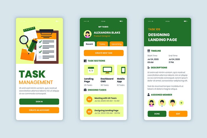
What Is a Mobile App Design System?
A design system is a centralized collection of reusable components, design principles, and style guidelines that ensure consistency across an app’s interface.
It typically includes:
- Typography styles
- Color palettes
- Spacing and layout grids
- Buttons, inputs, and icons
- UI components and states
- Documentation and usage rules
In simple terms, it’s your design playbook — a single source of truth that keeps your mobile app design cohesive and efficient.
Why You Need a Design System for Mobile Apps
Before we jump into the steps, let’s understand why every designer or product team should invest in one.
Benefits of a Mobile App Design System:
- Ensures consistency across screens and platforms
- Speeds up the design-to-development process
- Makes collaboration smoother between designers and developers
- Simplifies updates and scalability
- Improves overall user experience and brand identity
In short, a design system helps you design smarter, not harder.
Step-by-Step Guide: How to Create a Mobile App Design System from Scratch
Step 1: Define Your Brand Identity
Every great design system starts with a strong brand foundation. Before building components, clarify your app’s look, tone, and feel.
Ask these questions:
- What emotions should the app evoke? (e.g., playful, professional, calming)
- What color schemes represent the brand?
- What typography reflects your brand voice?
Pro tip: Create a quick mood board with logos, fonts, and color inspirations to guide your system’s visual direction.
Step 2: Establish Core Design Principles
Your design system should reflect the way you want users to experience your app.
For example:
- Clarity: Keep designs simple and intuitive
- Accessibility: Make your UI inclusive and readable
- Consistency: Maintain familiar patterns and spacing
- Scalability: Design for future growth and new features
Write these principles down — they’ll serve as the backbone of your decision-making process.
Step 3: Build Your Visual Style Guide
The style guide defines your app’s visual language. This step is where your design begins to take shape.
Key Elements:
- Color Palette:
- Choose primary, secondary, and neutral tones.
- Include light and dark mode variations.
- Document color usage rules (e.g., primary for buttons, secondary for highlights).
- Typography:
- Select 1–2 typefaces that are legible on mobile screens.
- Define heading, subheading, and body text styles.
- Set hierarchy (font size, weight, and spacing).
- Icons & Imagery:
- Use simple, consistent icon sets.
- Keep image ratios and corner radii consistent.
- Spacing & Layout:
- Define an 8px or 4px grid system for consistent spacing.
- Set rules for padding and margins.
Step 4: Create Reusable UI Components
This is where your design system truly becomes powerful. Build reusable UI elements that can be applied across multiple screens.
Examples:
- Buttons (default, hover, active, disabled)
- Text fields and dropdowns
- Navigation bars and tabs
- Modals, cards, and alerts
- Switches, checkboxes, and sliders
Pro tip: Use tools like Figma, Sketch, or Adobe XD to create component libraries with nested variants and auto layout features.
Step 5: Document Interactions and States
A great design system doesn’t stop at static elements — it defines how components behave.
For each UI component, document:
- Default, hover, active, and disabled states
- Animation or micro-interaction rules (e.g., button press effects, loading spinners)
- Accessibility behaviors like focus outlines and tap targets
This helps developers build interactive interfaces that match your design intent perfectly.
Step 6: Design Layout Templates
Once your core components are ready, start building layout templates for common screens such as:
- Login/Signup
- Dashboard or Home
- Settings
- Profile
- Error/Empty states
Templates help you apply the design system in real-world contexts and ensure your components align correctly across different screen sizes.
Step 7: Ensure Accessibility and Usability
A design system must be inclusive and user-friendly for everyone.
Check for:
- Proper color contrast ratios (use WCAG standards)
- Legible font sizes (minimum 14–16px for body text)
- Adequate spacing between tappable elements
- Support for assistive technologies like screen readers
Accessibility is not optional — it’s a key pillar of modern mobile UX design.
Step 8: Create a Design Documentation File
Document everything clearly so anyone joining your project can understand how to use the system.
Include:
- Visual examples of each component
- Usage rules and do’s & don’ts
- Interaction guidelines
- Naming conventions
Pro tip: Host your documentation online using tools like Notion, Zeroheight, or Storybook for easy access by your team.
Step 9: Collaborate with Developers
Design systems work best when designers and developers stay in sync.
Share assets and specifications using tools like:
- Figma Inspect or Zeplin
- Design tokens for color, spacing, and typography
- Version control to track updates
This collaboration ensures your app looks and functions as intended.
Step 10: Keep Iterating and Updating
A design system is a living product — not a one-time task.
Regularly review and update it as:
- New features are added
- Brand identity evolves
- Technology or frameworks change
Encourage feedback from designers, developers, and users to keep improving it.
Conclusion
Building a mobile app design system from scratch might seem like a big task, but it pays off enormously in the long run. A well-structured system boosts productivity, ensures brand consistency, and enhances user experience.
Remember — the goal isn’t just to create reusable components, but to build a design foundation that supports innovation and scalability.
Start small, define your rules, and grow your system over time. The result? A mobile app that’s cohesive, user-friendly, and future-ready.

