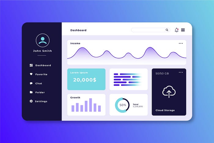
Dashboards have become the heart of every SaaS product. A well-designed dashboard doesn’t just display information — it helps users make smarter decisions, faster. Whether it’s tracking business KPIs, monitoring analytics, or managing workflows, the best dashboard designer combines functionality with aesthetics.
If you’re designing your next SaaS product, let’s explore some of the most inspiring dashboard design ideas from top platforms that master the art of clarity, usability, and visual appeal.
1. Why Dashboard Design Matters in SaaS
A dashboard is often the first impression users get after logging in to a SaaS platform. It sets the tone for usability, engagement, and trust. When done right, it can make complex data simple, interactive, and even enjoyable.
A great SaaS dashboard design should:
- Provide clear visual hierarchy — important metrics first.
- Offer customization — so users can personalize what matters to them.
- Maintain consistency with the brand and user experience.
- Ensure responsive layouts across devices.
Now, let’s look at how some of the best SaaS companies achieve this.
2. Notion – Clean, Minimal, and Modular
Why it inspires:
Notion takes minimalism to another level. Its dashboard focuses on flexibility, allowing users to build their own workspace. The clean white background, soft typography, and modular layout make it incredibly easy to navigate and customize.
Design takeaway:
Use modular cards or blocks to let users tailor the dashboard experience. A minimal, distraction-free UI keeps users focused on content rather than clutter.
3. Asana – Visual Project Clarity
Why it inspires:
Asana’s dashboard offers a perfect balance between simplicity and information density. Users can instantly view project statuses, upcoming deadlines, and workloads in a color-coded format.
Design takeaway:
Leverage color coding and visual hierarchy to guide attention. Use subtle animations to enhance clarity — not overwhelm it.
4. Slack – Smart Navigation for Fast Access
Why it inspires:
Slack’s admin and workspace dashboards shine because of their intuitive structure. Navigation is compact, icons are easily recognizable, and the focus is on quick access to key features.
Design takeaway:
Keep navigation minimal yet functional. Group similar tasks under recognizable icons and make sure the most used actions are one click away.
5. Figma – Collaborative Power with Clarity
Why it inspires:
Figma’s design dashboard manages to present collaboration tools, design files, and community resources all in one place — without feeling cluttered. The use of white space and bold typography creates a sense of order and energy.
Design takeaway:
Use white space strategically. It makes dashboards feel light, modern, and easy to scan.
6. HubSpot – Data-Driven with Context
Why it inspires:
HubSpot’s CRM dashboard beautifully blends analytics with usability. Each chart, graph, and number tells a story, helping users track leads and conversions effortlessly.
Design takeaway:
Combine data visualization with storytelling. Make your metrics meaningful with clear labels, comparison visuals, and easy-to-read graphs.
7. Airtable – Colorful but Organized
Why it inspires:
Airtable’s dashboard thrives on customization. Its grid layout and color-coded systems make managing projects, data, and teams visually engaging and efficient.
Design takeaway:
Don’t be afraid of color — when used wisely, it helps users differentiate categories and interpret data faster.
8. Monday.com – Action-Oriented Design
Why it inspires:
Monday.com’s dashboard focuses on task visibility and teamwork. Interactive widgets, charts, and progress bars help teams visualize goals at a glance.
Design takeaway:
Make dashboards action-oriented. Include buttons, filters, and charts that encourage users to engage, not just observe.
9. Google Analytics – Power in Data Density
Why it inspires:
Google Analytics is known for its complexity, but its dashboard remains a standard in data visualization. With filters, drill-downs, and interactive charts, it gives users deep insights into website performance.
Design takeaway:
If your platform handles complex data, use progressive disclosure — show essential insights first and allow users to explore deeper layers when needed.
10. ClickUp – Unified Workspace Design
Why it inspires:
ClickUp’s all-in-one productivity dashboard gives users complete control over projects, timelines, and reporting. Despite its vast features, the UI remains user-friendly and balanced.
Design takeaway:
Use consistent iconography and layout grids to keep complex dashboards clean and intuitive.
Key Principles for Great Dashboard Design
Here are the universal principles behind every successful SaaS dashboard design:
1. Prioritize Clarity
Don’t overwhelm users with data. Focus on showing the most relevant information first and use visual hierarchy to emphasize key metrics.
2. Use Visual Cues
Icons, color codes, and typography help users quickly interpret data. Consistency across these elements enhances usability.
3. Offer Customization
Allow users to drag, hide, or resize widgets. Personalization increases engagement and satisfaction.
4. Keep Interactions Simple
Users should reach their goals with minimal clicks. Use dropdowns, tooltips, and search bars to simplify complex data navigation.
5. Design for Mobile Too
Dashboards aren’t just for desktops anymore. Mobile-responsive dashboards are critical for modern SaaS tools.
Conclusion
The best dashboard designs are more than beautiful—they’re functional, data-driven, and user-focused. From Notion’s simplicity to HubSpot’s analytics power, each of these top SaaS platforms proves that good design enhances usability and decision-making.
If you’re building or redesigning your SaaS dashboard, focus on clarity, responsiveness, and engagement. Remember: a dashboard should empower users to understand, act, and succeed—all at a glance.