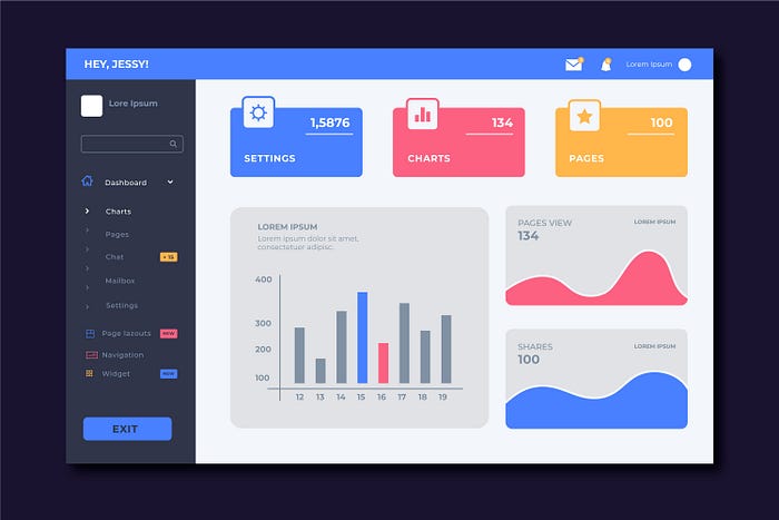
The admin dashboard is the control center of your product. It’s where users manage data, monitor performance, and make critical decisions. But if your dashboard is cluttered, confusing, or slow to navigate, it can frustrate users—and even drive them away.
A well-crafted admin dashboard design combines functionality with aesthetics, making data easy to understand and workflows efficient. In this blog, we’ll share the best practices for designing admin dashboards for SaaS platforms that users will actually love to use.
admin dashboards play a critical role in managing data, monitoring performance, and ensuring smooth operations. A well-designed dashboard isn’t just a collection of charts and tables — it’s the control center that empowers users to make informed decisions, track key metrics, and take action quickly.
When designed poorly, dashboards can overwhelm users with clutter, confusing layouts, and irrelevant information. But when designed with best practices in mind, they provide clarity, usability, and value that elevate the overall SaaS experience. In this blog, we’ll explore the best practices for designing admin dashboards that drive efficiency and deliver seamless user experiences.
Why Admin Dashboard Design Matters in SaaS
For SaaS platforms, the admin dashboard is more than just a feature — it’s the heartbeat of the system. Whether it’s tracking sales, monitoring customer activity, or managing workflows, the dashboard provides visibility into the platform’s health and performance.
A thoughtfully designed dashboard offers:
-
Quick insights into real-time data.
-
Streamlined workflows for admins and teams.
-
Improved decision-making with actionable visuals.
-
Greater efficiency by minimizing the need for complex navigation.
In short, a dashboard should empower users, not confuse them.
Best Practices for SaaS Admin Dashboard Design
1. Keep It Clean and Minimal
Dashboards are often filled with complex data, but simplicity is key. Avoid overloading the screen with too many widgets, colors, or metrics. Instead, highlight the most important KPIs upfront and let users drill down into details if needed.
Tip: Use whitespace strategically to give breathing room and improve readability.
2. Prioritize Key Metrics (KPIs)
Not all data is equally important. Identify the KPIs most relevant to your users and make them prominent. For example, an e-commerce SaaS might prioritize revenue, orders, and conversion rates, while a project management SaaS may emphasize task progress and deadlines.
Example: Slack’s admin dashboard focuses on user activity and engagement, helping teams quickly assess adoption and performance.
3. Design for Usability, Not Just Looks
A visually appealing dashboard is great, but usability should always come first. Make sure users can quickly locate what they need, with logical groupings, intuitive navigation, and consistent design patterns.
Tip: Apply the “less clicks, more action” principle — the fewer steps required to complete a task, the better.
4. Provide Customization Options
Every user has different needs. Allowing admins to customize their dashboards with widgets, filters, and rearrangeable panels adds flexibility and makes the dashboard more valuable.
Example: Google Analytics lets users create custom dashboards tailored to their specific reporting requirements.
5. Ensure Responsive and Cross-Device Compatibility
In today’s mobile-first world, many admins access dashboards on tablets or smartphones. A responsive design ensures the dashboard adapts seamlessly to different screen sizes without compromising usability.
Tip: Prioritize critical data for smaller screens and use collapsible menus to save space.
6. Use Data Visualization Wisely
Charts, graphs, and infographics make complex data more digestible, but too many visuals can overwhelm users. Choose the right visualization type for each dataset — bar charts for comparisons, line charts for trends, and pie charts for distribution.
Tip: Add interactive elements like tooltips or hover states to provide additional insights without cluttering the main view.
7. Incorporate Real-Time Updates
For SaaS platforms, real-time data is often critical. Dashboards that refresh automatically (without manual reloads) keep users informed of the latest metrics, whether it’s system performance, sales, or user activity.
Example: Financial SaaS dashboards update in real time to help businesses monitor transactions and avoid risks.
8. Maintain Consistent Design Patterns
Consistency builds familiarity and reduces the learning curve. Use the same colors, typography, and iconography across all dashboard sections. This ensures users don’t waste time figuring out new layouts or controls.
Tip: Develop a design system or style guide to maintain consistency across the platform.
9. Include Clear Alerts and Notifications
Admins often rely on dashboards to flag critical issues. Alerts and notifications should be clear, concise, and actionable. Color codes (like red for urgent or green for successful) help highlight status updates at a glance.
Example: SaaS platforms like Jira use notifications effectively to ensure admins never miss important updates.
10. Test with Real Users
What looks good to a designer might not be practical for an end-user. Conduct usability testing with real admins to gather feedback and identify friction points. Iterative testing helps refine the dashboard for maximum efficiency.
Tip: Use A/B testing to compare variations and optimize layouts based on actual user behavior.
Common Mistakes to Avoid in Dashboard Design
-
Overloading users with too much data.
-
Ignoring mobile responsiveness.
-
Using inconsistent design elements.
-
Neglecting customization and personalization.
-
Failing to provide context for data (e.g., numbers without benchmarks).
Avoiding these mistakes ensures your dashboard adds value rather than complexity.
Future Trends in Admin Dashboard Design
As SaaS continues to evolve, so do dashboards. Some emerging trends include:
-
AI-powered dashboards that offer predictive analytics.
-
Voice-enabled commands for faster navigation.
-
Personalized dashboards driven by machine learning.
-
Dark mode and adaptive themes for user comfort.
Adopting these innovations will help SaaS platforms stay ahead of the curve and deliver modern, user-friendly dashboards.
Conclusion
An admin dashboard is the command center of any SaaS platform. When designed with best practices in mind, it transforms raw data into actionable insights, enhances usability, and empowers users to work smarter. By focusing on simplicity, prioritizing key metrics, providing customization, and embracing responsive, consistent design, SaaS businesses can deliver dashboards that truly drive value.
In a competitive digital marketplace, dashboards are not just a feature — they’re a differentiator. Investing in thoughtful, user-centric dashboard design ensures your SaaS platform stands out, builds trust, and supports long-term success.


